
We’ve been waking up to frosty gardens and icy roads this week and I’ve been thinking about the colours of winter.
Winter has such a magical way of simplifying the world, doesn’t it? Suddenly colours feel calmer, softer, or totally dramatic depending on the day. From icy mornings to festive greenery to elegant muted tones, winter is full of gorgeous colour moments that translate beautifully into branding and web design.
If you’re looking for winter colour palette inspiration, here are some winter colour palettes that don’t just look good — they tell a story, create emotion and shape how people experience a brand.
Snow & Ice — Cool Blues & Crisp Whites
When you think winter, the first thing that probably comes into your head is snow (even though we don’t get much here in South Devon!). Snowflakes, frost on the ground, ice on the windows, maybe even plans for a ski trip and of course that refreshing chill in the air. Blue and white captures exactly that feeling — clean, calm and crystal clear.
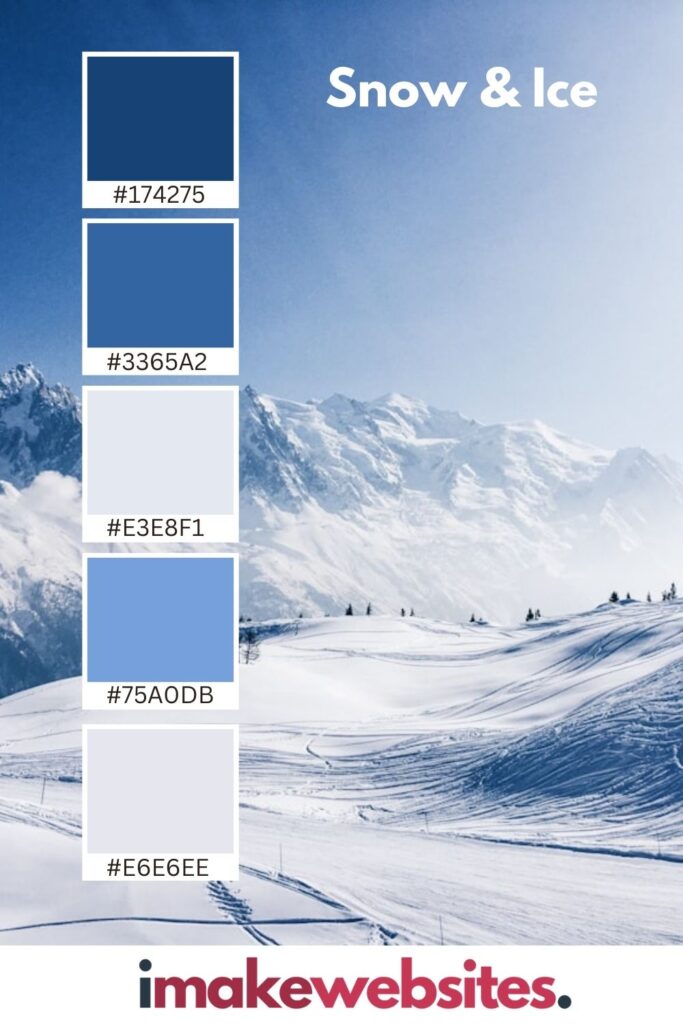
This combo feels peaceful and trustworthy. It gives off “we’ve got everything under control” energy without being boring or clinical. It’s great for brands that want to feel fresh and reliable, and it works well for tech, healthcare, wellness or anything that needs a modern, crisp vibe.
Winter Greenery — Whites, Greens & Berry Red
Another classic wintery colour palette has to be red, white and green. Think snowy forests, pine trees, holly leaves and red berries popping through the frost. This palette feels undoubtedly festive. Green brings that natural, earthy grounding, while pops of red add warmth and life.
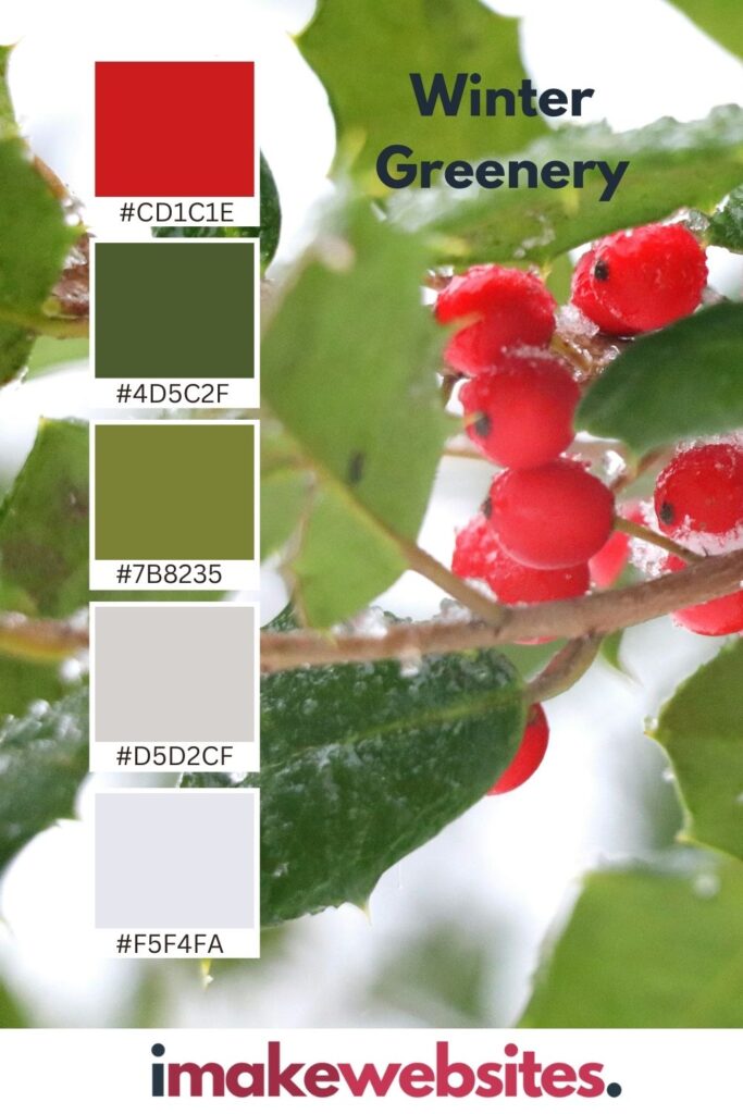
It feels comforting, traditional in a good way, and full of heart. Perfect for lifestyle brands, eco-focused businesses, artisan shops, cafés, florists… anything that wants to feel friendly, welcoming and a little nostalgic.
Soft Winter Neutrals — Calm, Minimal & Effortlessly Stylish
Winter isn’t always bold and dramatic. Sometimes it’s quiet and still, particularly after the festive season has passed. Think knitted scarves, candlelight, soft blankets and cloudy skies. Neutral tones like creams, taupes and warm greys create that beautifully understated, grown-up look.
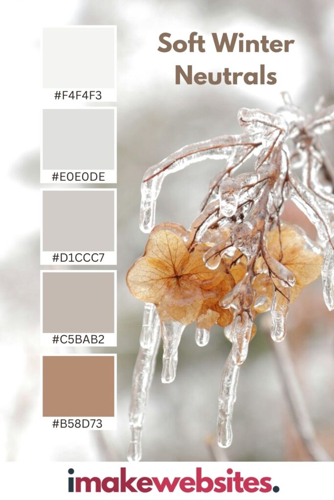
These colours instantly feel elegant and luxurious without trying too hard. They whisper instead of shout. They’re brilliant for fashion, interiors, luxury brands, editorial sites or anyone wanting a minimalist, “we have great taste” aesthetic.
Winter Calm — Soft Greens & Whites
I love it when winter draws to a close and the snowdrops start to peek through. It fills me with hope for the future. This palette feels more peaceful and nature-inspired. Picture quiet woodland walks, frosted leaves and cool stillness. Green paired with white feels calm, balanced and very grounding.
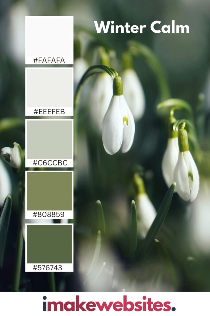
It’s perfect for wellness brands, eco-conscious businesses, outdoor lifestyle companies or anything connected to nature, calm or wellbeing. It feels soothing — like a deep breath.
Winter Twilight — Moody Purples & Deep Blues
There’s something magical about winter evenings when the sky shifts into deep blues and purples before it turns dark. This palette feels dreamy, mysterious and full of emotion.
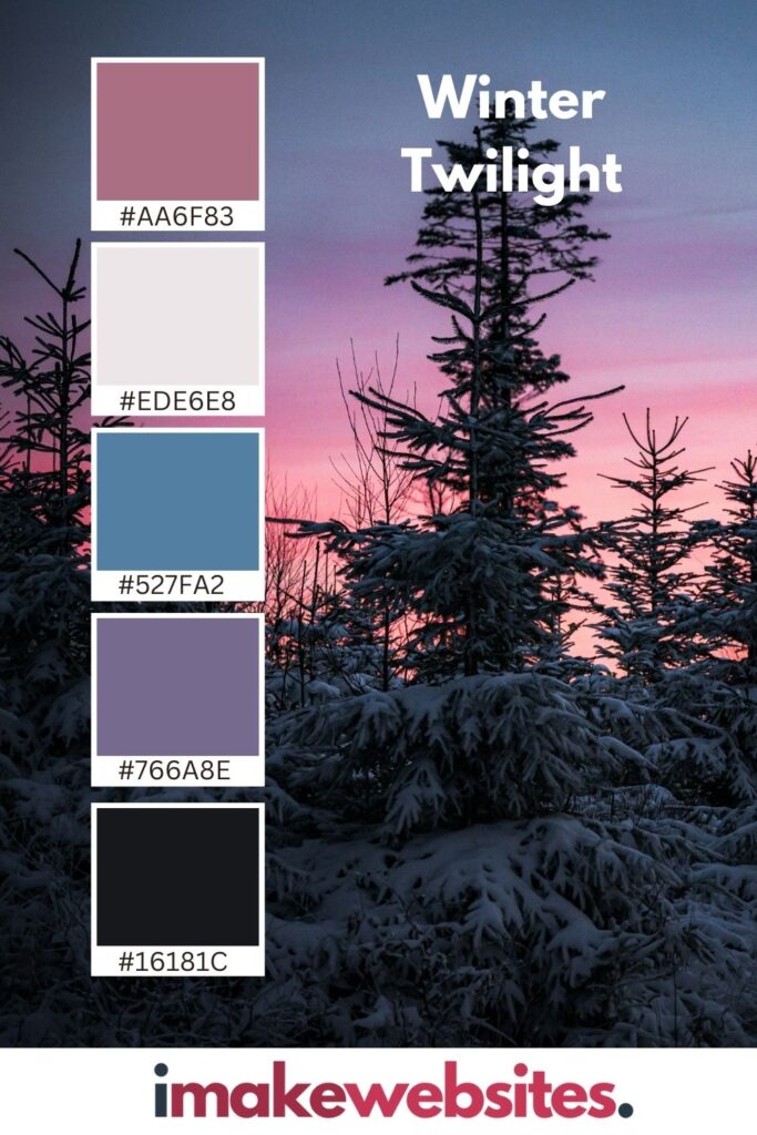
It’s great for creative brands, beauty, luxury lifestyle businesses or websites that want to feel atmospheric rather than straightforward. It’s a little romantic, a little dramatic and definitely memorable.
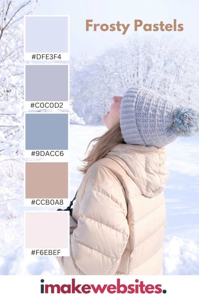
Frosty Pastels — Soft, Light & Whimsical
Winter can also be soft and playful. Think sunrise on snow, pastel scarves, soft skies. Frosty pastels like light pinks, blues and soft lavender feel gentle, modern and comforting.
They’re wonderful for family brands, boutiques, creative businesses and anything wanting to feel friendly and approachable while still stylish.
Winter palettes are so much more than “cold colours.” They can be bold, cozy, minimal, luxurious, playful or calming — and each combination changes the way a brand or website feels. Whether you want something refined and elegant or warm and welcoming, winter is full of colour inspiration waiting to be used.
Are you ready for a new website that feels more like you?
If your site feels a little outdated, doesn’t really sound like you anymore, or just doesn’t support where your business is heading… a refresh could make a huge difference. I design friendly, strategic WordPress websites for small businesses who are ready to step confidently into their next chapter.

All photos courtesy of Unsplash.


